Wefox: Introducing dynamic in-app checkout
Redesigning the checkout flow for insurance app/webapp
TL;DR
I redesigned the wefox insurance app/webapp's checkout. Our goal was to create an adaptable checkout process for different insurance products and regions. I conducted competitor research, usability tests, and user interviews. We outlined requirements, flow, and platform considerations, emphasizing a mobile-first approach. After sketching out ideas and mapping the flow, we tested two prototypes. While I updated wireframes based on test feedback, my UI designer worked on a new component library. We chose material design for its adaptability. Finally, I updated wireframes in Sketch with the new components and shared them using Zeplin for handoff.
I redesigned the wefox insurance app/webapp's checkout. Our goal was to create an adaptable checkout process for different insurance products and regions. I conducted competitor research, usability tests, and user interviews. We outlined requirements, flow, and platform considerations, emphasizing a mobile-first approach. After sketching out ideas and mapping the flow, we tested two prototypes. While I updated wireframes based on test feedback, my UI designer worked on a new component library. We chose material design for its adaptability. Finally, I updated wireframes in Sketch with the new components and shared them using Zeplin for handoff.

Intro
Wefox is your digital insurance broker which helps manage and set up new insurance contracts via apps (Android, iOS) and web.
I was working as the UX designer/researcher for the B2C service. Together with my PM, UI designer, and dev team we create a dynamic checkout flow for new insurance setup. This project was also used as a base to update the components library for all platforms.
I was working as the UX designer/researcher for the B2C service. Together with my PM, UI designer, and dev team we create a dynamic checkout flow for new insurance setup. This project was also used as a base to update the components library for all platforms.
My role: Competitor research / Usability tests / User interviews / Wireframing / Prototyping / Stakeholder interviews
Timeline: Apr. - Jun. 2020
Timeline: Apr. - Jun. 2020
Background
The old checkout flow was blocking us from adding new types of insurances or launch in new countries as it was statically made for each insurance products.
Business goal
To have a dynamic checkout page where we can display different fields/information depending on the requirements for different regions and insurance products.
User goal
To provide the user with an easy and universal checkout process, enabling them to feel in control while completing a purchase for the right product.
Understand
Competitor research
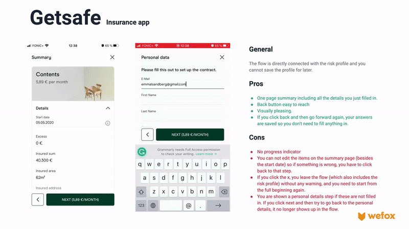
After the project kickoff and talking with stakeholders I started checking out what other apps has done to solve the problem before together with my UI designer. We downloaded and played around with a few apps and put together a quick pros and cons presentation.

User interviews
These interviews were conducted for another project, but provided some interesting points for checkout. We interviewed five people and the participants were recruited to fit our target audience and needed to be interested in getting a private health insurance.
Key findings (F)
Insights (I)
F: All participants wanted to be able to review the full contract in their own time before they could make a decision.
I: Make sure the user can review all details of the contract before starting to fill in information.
F: One user stated that it is important to know if she has the possibility to change her mind once she signed the contract and said this would make it easier for her to commit.
I: Consider including a line that the user has 14 days (at least in the EU) to cancel a contract in the checkout to strengthen trust and make it easier to commit.
F: Users were understanding of providing personal info, but there was a worry that old data would be shared or used once it is no longer valid.
I: Show the user what data we are using and make it possible to edit.
Requirements
Flow
These are the general requirements for the checkout “skeleton” and flow which will contain the
These are the general requirements for the checkout “skeleton” and flow which will contain the
- The flow starts after the user clicks on “choose offer” in the comparison page.
- The steps in the flow need to be independent of each other.
- The flow should work regardless of if there is 1 step or 20.
Sections
These sections needs to be able to fit into the skeleton.
These sections needs to be able to fit into the skeleton.
- General info (e.g. start date, name, gender, date of birth, email, address)
- Documents + accept option
- Payment method
- Signature
- Legal consent
Platform
- Mobile first!
- The checkout will be available for all platforms (Android, iOS, Responsive web)
Components
We need designs for these components.
We need designs for these components.
- Text/number input (long and short)
- Multiple choice
- Date picker
- Document list
- Consent checkbox
- Signature drawing
Ideation
Armed with a clear understanding of the business and user need and the inspiration from the competitor research I moved on to sketching out ideas for the flow and layout.
Sketching out ideas
As many other designers, I like to do my first sketching on paper. I try to get as many ideas out as possible quickly. Once I felt I had enough, and after a coffee break, I went back to my sketches and highlighted elements I wanted to keep. I also showed the sketches to my PM and UI designer to get fresh eyes on it and make sure we're aligned.

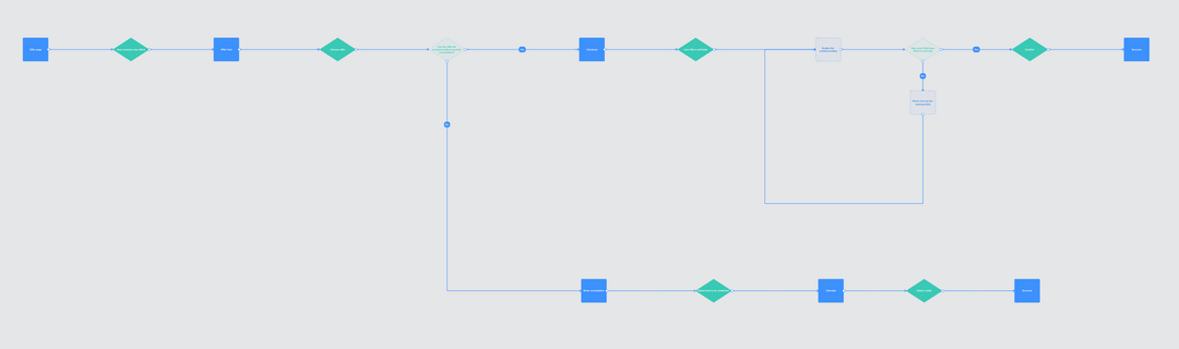
Mapping out the flow
In parallel, I mapped out the flows and presented it to the dev team (and PM and UI designer) for feedback. After discussing it we realised there were two versions we would like to test.

Prototype in Figma
After sketching out ideas I decided to test two possible flows before settling on one approach and going into details. Both prototypes display a progress tracker, a product summary with the option to expand more details in the bottom, and a back button on the top of the page.

Prototype A
Displays one task per screen and has a horizontal progress tracker to match the flow of the navigation.

Prototype B
Displays all tasks in one page and the user navigates by scrolling vertically. Each step is given a lot of space to minimise cognitive load. The progress tracker is moving in the same direction as the steps (vertically).
Test
I tested both prototypes with three test participants to see which option they prefer and how easy it is for them to complete the process.
Analysing the results
I gathered the notes from the interviews on a Miro board to look for trends and notabel observations.

Key findings (F)
Insights/possible steps (I)
F: All participants prefered Prototype B and said that the one step per screen felt more tedious and frustrating to use.
I: Use Prototype B as a base.
F: 2/3 disliked the high amount of white space and excessive scrolling and would like to be able to see more input fields at the same time. However, all participants also expressed that the process was easy and straightforward and that they always know what to do next.
I: . The excessive spacing could be the reason for the low cognitive load, but it probably could be smaller and still have the same effect. Try to find a balance.
F: It disturbed one participant that the section automatically switched when clicking on the go button
I: Rename the button “Next” and highlight it. Having a clear close keyboard button.
UI updates
While I was working on updating the flow and wireframes with the feedback from the test, my UI designer created the new component library. We decided to base it on the material design library as this would be easy to adapt to all our platforms.
As a last step, I updated wireframes in sketch with the new components and uploaded them to Zeplin for handoff.
As a last step, I updated wireframes in sketch with the new components and uploaded them to Zeplin for handoff.


Vivy: Guiding users through a complicated signup flow

Cobalt: Introducing a new product

Cobalt: Improving peer feedback delivery