Vivy: Guiding users though a complicated signup flow
Bringing the sign up success rate from 33% to 100% in 7 days
TL;DR
I worked together with a researcher to raise a 33% sign-up success rate to 100% in 7 days for an invitation-based health app. Users encountered issues with ID verification and frequently abandoned the process. We made improvements by guiding users along an unconventional path, reducing text, and clarifying actions. Experiments, including unmoderated tests of two Figma prototypes with six testers each, were conducted to validate the changes. Results showed a 100% success rate, but some users initially took the wrong path. The key lesson learned: users often overlook or forget instructions, underscoring the importance of clear guidance.
I worked together with a researcher to raise a 33% sign-up success rate to 100% in 7 days for an invitation-based health app. Users encountered issues with ID verification and frequently abandoned the process. We made improvements by guiding users along an unconventional path, reducing text, and clarifying actions. Experiments, including unmoderated tests of two Figma prototypes with six testers each, were conducted to validate the changes. Results showed a 100% success rate, but some users initially took the wrong path. The key lesson learned: users often overlook or forget instructions, underscoring the importance of clear guidance.
Intro
My role: I was the only designer on this project together with a researcher
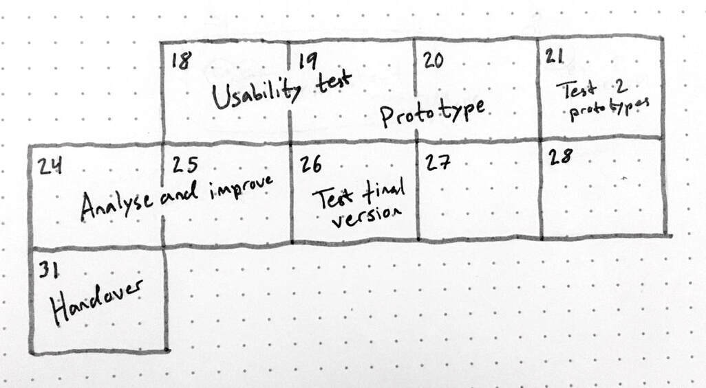
Timeline: Jun. 18 - 26 2021
Timeline: Jun. 18 - 26 2021
Vivy is a health prevention app that insurances give as part of their service offering to their insurees. Access is invitation-based. It’s certified as a medical product so privacy and security standards are high and strict.
In 4 weeks, Vivy’s first Malaysian insurance customer will send out thousands of invitation emails to their customers.
All of our hard work will finally pay off.
Our researcher is running usability tests of the onboarding while I (the product designer) observe and take notes. We are using the real invitation email and the real live app for the first time. We’re excited to see how users interact with our app. But the excitement quickly turns into dread when we see user after user struggle.
Holy sh*t, only 33% can get through the ID verification process...
Worst of all, they don’t even seem to understand that something is wrong and they simply give up stating “I guess my insurance isn't supported”.

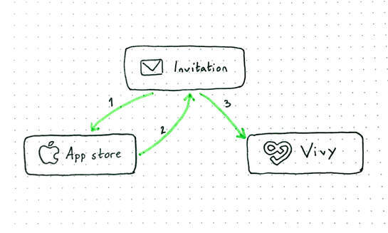
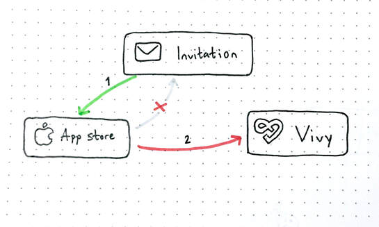
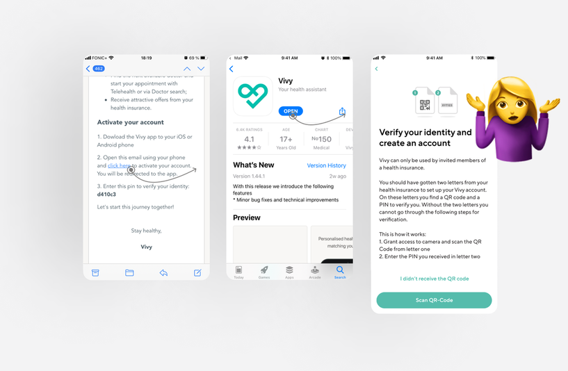
The testers have to install Vivy from the app store and then click on the “account activation” link in the email. If Vivy is installed, the link automatically opens the app and take them to the page where they can verify their ID. The instructions are written in the email.
However, after the testers install the app, they instinctively open it directly from the app store. When the app opens, they are faced with sign up options for Germany (Germany sends invites with QR codes by post) and when they don’t find any more buttons to try, they give up. Only one person goes back to the email for instructions.
"I would never have gone back to the email"
– Distraught test user

As the researcher is wrapping up the last interview, I’m starting to work. We can’t do anything about the confusing flow because of security as well as technical complexity.
So, what do we need to do?
- Make users take an unnatural path.
- Rely less on written instructions (if there is a big green shiny button on the page, the user will press it even if they know full well that they don’t have a QR code).
- Improve the linking in the email and better guide the user to start with installing the apps (so that they don’t press the activation link to do this).
- Catch people who end up on the German account creation page after installing the app and guide them back to the email.
- Take into account the different paths the user can take to activate their account and make sure we support and don’t disrupt any of the flows.
- Every screen should have a clear action for the user to take.
- Do this quickly or else we won’t be able to onboard users.
To verify our assumption that simply giving clearer instructions will not solve the problem, we run two experiments.
One with just a text change alongside one where we also revised the flow. The tests were done unmoderated via the RapidUsertest platform. All the testers had to do was get through the ID verification.
Tests
Method: Unmoderated tests of two Figma prototypes with six testers per prototype
Task: Activate your account
Method: Unmoderated tests of two Figma prototypes with six testers per prototype
Task: Activate your account
Both versions were improvements to the original flow, but we could clearly see that people don’t actually read and we need to make it less text-heavy. People are drawn to click their way through a flow.
For the text version, they were almost all first drawn to the big green button.
The testers were seemingly clicking around at random before getting frustrated and finally reading the text.
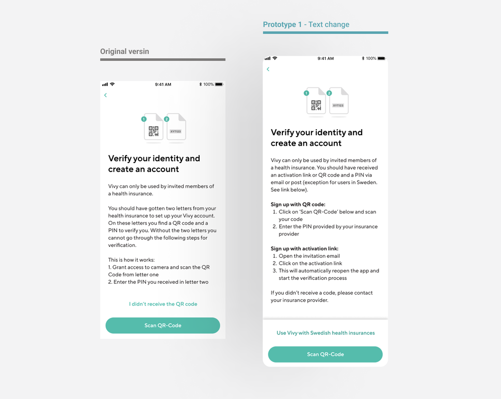

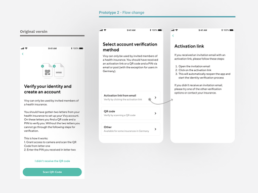
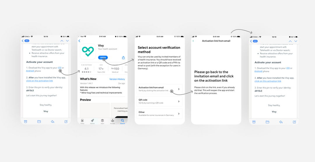
With the flow change, the testers could easier digest the options and most were guided to the right path.
However, some users still struggled to take in the information once they landed on the page with the instructions.
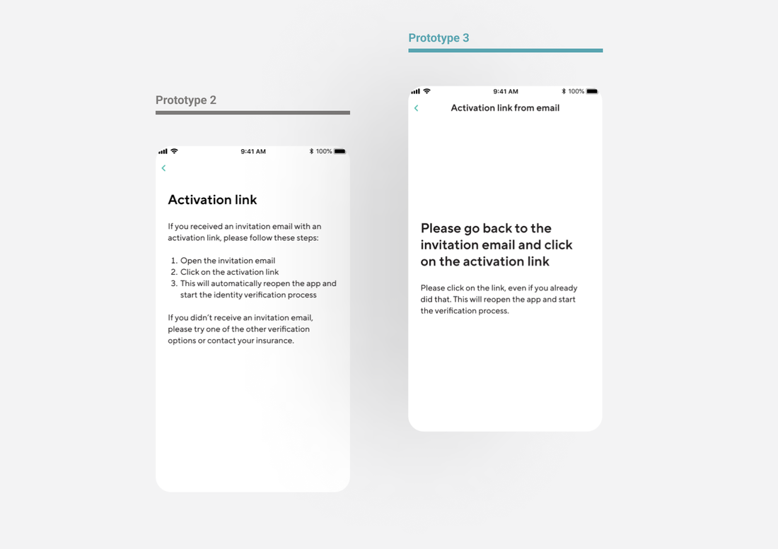
We decided to go with the flow change version, but we made a new prototype with less text. as we saw that we were able to make people go to the activation email path. Some users still struggled to take in the information, so we made a new prototype with less text. We repeated the same test as before, and using less text made a difference.
We were able to get all the testers through the flow!

In the 7 working days we spent on this project, we run a total of 25 user tests.
The task success rate went from 33% to 100%!
With our changes, we were able to allow all users to recover from taking a wrong turn, but only 2 out of 6 got the right path on the first try. For the future, we should look into how we can rework the flow to make it more intuitive while still keeping secure.
The moral of this story:
People don’t read. Even if they do, they don’t remember, so make sure to always guide them to the next step.
People don’t read. Even if they do, they don’t remember, so make sure to always guide them to the next step.


