WORK > MARIA LAGER
Mobile first design for an established artist
Website redesign for marialager.com
My role
UX/UI design
Prototyping
Research
User testing
Implementation
Prototyping
Research
User testing
Implementation
Tools
Adobe XD
One.com, website builder
Typeform.com
One.com, website builder
Typeform.com
Goal
Show who Maria Lager is
Show what kind of art she does
Show where to see her art
List her previus exhibtions
Show what kind of art she does
Show where to see her art
List her previus exhibtions
The assignment
What she wants
Maria doesn’t feel her current webiste is showing who she is. She would like to show her history more. Both of the art and her background. As a contemporary artis, who constantly have new art to show, she wntsto easily be able to update the page and add the latest news. Currently, Maria is currently referring people who she meets that are interesed in her art to her instaram account, but she would prefer to be able to send them to her website as she feels this looks more profesional. These encounters ofthen happens away from a computer, so it's important to her that the page is mobile friendly.
Limitations
The page need to be easy for Maria to update. The current website is hosted and managed using the drag and dropp website builder at One.com. With her plan, she can have up to 5 published pages. The page has a responsive mode, but it cannot be edited more than reordering the elements.
Research
One.com statistics
One.com offers insights in user location, platform and time spent on the page. Maria have between 300-400 visitors a month, mainly from Sweden. She has more around the times of the opening of her exhibitions and less in times between exhibitions. Most users who visit marialage.com only stay for a few seconds which makes me guess that they come mainly to see what art she does. As this is shown on the first page and there only are a few pictures displayed, they are quicly done. This is an asumption I need to test.
Online servey
I joined art communities on Facebook and posted a qualitative survey to learn more about people’s art browsing habits. I asked them to in, in their own words, tell me what they want to see when they visit an artist’s website.
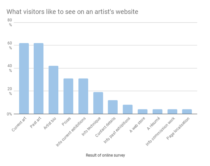
As shown in the graf, the art itself is the most important to the visitors, but many people were also interested in the artist’s own history, details about upcoming events. Even though prices were interesting, only 4% was looking for some sort of web shop.

Mapping out the site
First version and testing
After considdering the requirements from Maria, and the user needs, I created a site map using pen, paper, and sticky notes. I proceeded to reach out to Swedish speaking friends of mine to test it. I asekd the pertisipants to immagine that they are on homepage of marialager.com and they see three categories: Art; Exhibitions; About Maria; and next to them you also see her email address. I then asked them to tell me where they would click to find:
1) Current art (Konst hon gör idag)
2) Where to find the art (Vart du kan see hennes konst)
3) Learn what technique she uses (Vad för teknik hon avnänder)
4) Buy something from her (Köpa nagot fran henne)
5) Previous art (Tidigare konst)
6) how much the art costs (Hur mycket hennes tavlor kostar)
7) upcoming exhibitions (Kommande unställningar)
Results of the test
Following the test results, Exhibitions (Utställningar) was changed to 'Current' (Aktuellt) as people tended to go there to find pictures form exhibitions rather than just finding dated for her upcoming exhibitions. 'Art' (Konst) was also changed to 'Gallery' (Galleri) as Maria don't like using that term. I decided to skip the dedicated home page and send users directly to Gallery as this is the main reason users visit the page. We also decided to, for the time being, scrap the new idea of a monthly piece, which was intednded for maria to sell ne painting a month via the her website. The consept might instead be tested via her instagram page.
Wireframing and prototying
I almost exclusivly use Adobe XD for my wirefram and hf designs. The program is clean and has a great built in prototyping tool which makes it possible to actually see the changes you make to the prototype live in your phone.
Click through the embedded wireframe prototypes for Mobile and Desktop
High fidelity version and testing
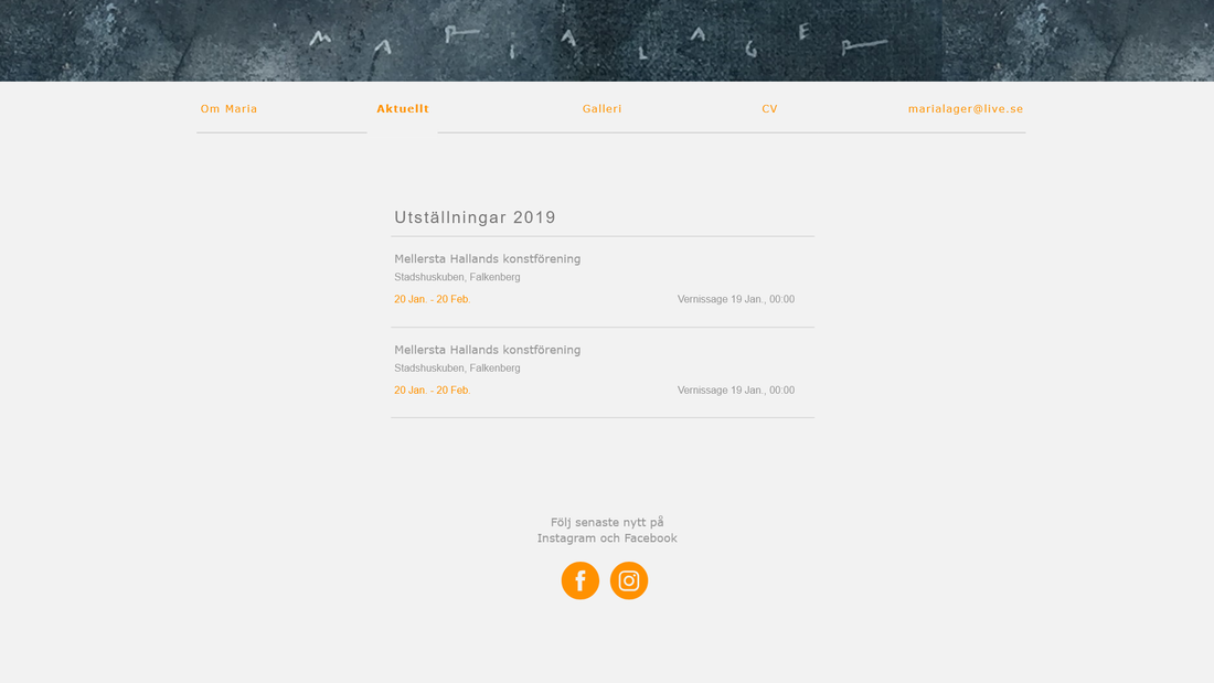
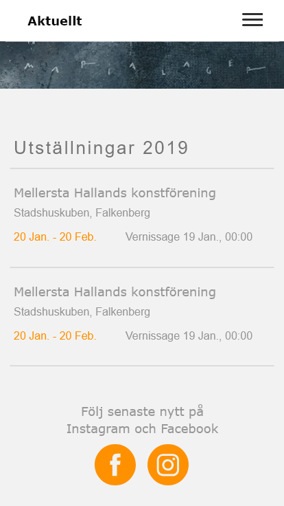
After getting feedback on the Wireframes from Maria, we decided to skip the section 'Reprecented' (representedar) under 'Current' (Aktuellt) as she don't feel she has enough time to check the status of which galleries currenlty have painitings available.
On the same page, I also moved the social media links to the bottom of the page, as the upcoming exhibitions should be what has the main focus on this page.
On the same page, I also moved the social media links to the bottom of the page, as the upcoming exhibitions should be what has the main focus on this page.
Click through the embedded HF prototypes for Mobile and Desktop
Finished design
Notes from user tests:
- The home page (Galleri) doesn't feel lika a home page, which it curenly is.
- The grayness of the text makes it feel like a parantece and not a page description.
- The top of the page feels empty with just the signature with a white background.
- The menu isn't alligned to anything (woops)
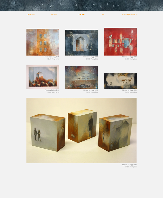
- It's great to be able to see the a lot of pictures and to see the material that was used.
- The Text under the picture takes ut a bit too much space. (made it 3 lines. + added the year in the title space)
- Removed the title for the immage section as having one section per year will result in too many pictures and as One.com doens't have a load more option, it will result in too much load time.
- We explored using a dark theme, but tho this did make the pictures pop, it didn't feel Maria and we decided to not go with it for the time being.
Click through the embedded final prototypes for Mobile and Desktop
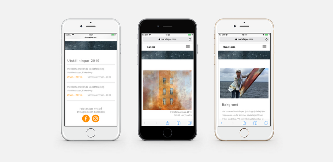
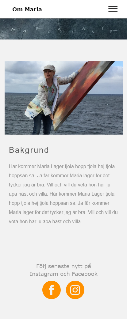
All screens - Mobile


All screens - Desktop


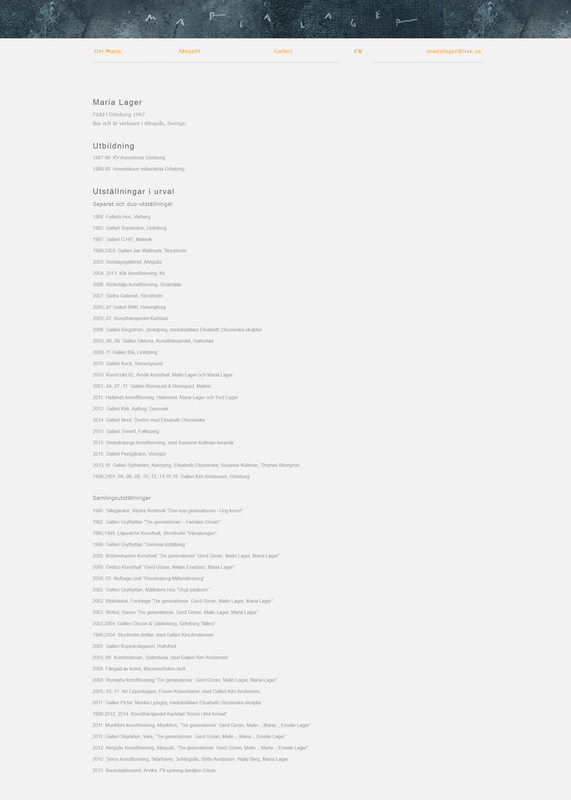
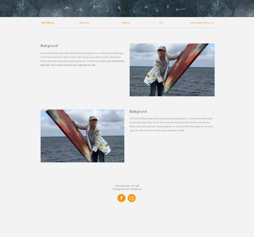
Implementation
As soon as Maria provided content (text and images) I will start Implementing the designs using her current website builder at One.com. I have done my best to make sure all the designs will be possible to implement, but some things might still change.
To be continued...

